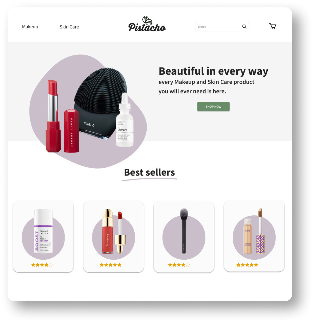
Pistacho

The initial idea:

Overview

Pistacho is a small new business that resells beauty and personal care items for women.
‍
They mostly sell their products in person or their Instagram and Facebook pages but want to diversify and expand their sales points.
‍
The goal is to create a minimalist, efficient design that easily allows users to browse through Pistacho’s product catalog.

The problem

How to make the shopping process enjoyable and easy for Pistacho’s users?
Pistacho has a broad catalog of products, which can be an issue for users who don’t have the time or patience to browse every tab and page for their desired item.

Research

Research on e-commerce:

According to the Baymard Institute’s study on Homepage & Category Navigation UX,
“the subjects (in the test sessions) would repeatedly abandon sites because they were unable to find the products they were looking for.”

Therefore, in this project, my main focus is the user’s usability on the internal searching mechanism of the website.

Competitor analysis:

Upon researching other makeup online shops, I realized that in most cases, they missed the key idea of keeping their catalogs clutter-free to avoid confusion for the user.

Even if most of the online shops I analyzed utilized light backgrounds to display their products, they failed at organizing their items so the user can have a clear path to follow while shopping for specifics.

I began my initial user interviews with this idea in mind, trying to gather more information from my user demographic.

User interviews:

I interviewed 5, women between 23 to 27 years old, who provided me with their own experiences shopping for makeup and skincare online.

They shared their frustrations and common issues while shopping online.

I gathered the information and categorized it into three different key actions that would help me avoid those problems in my future design.

Key actions to follow
while designing

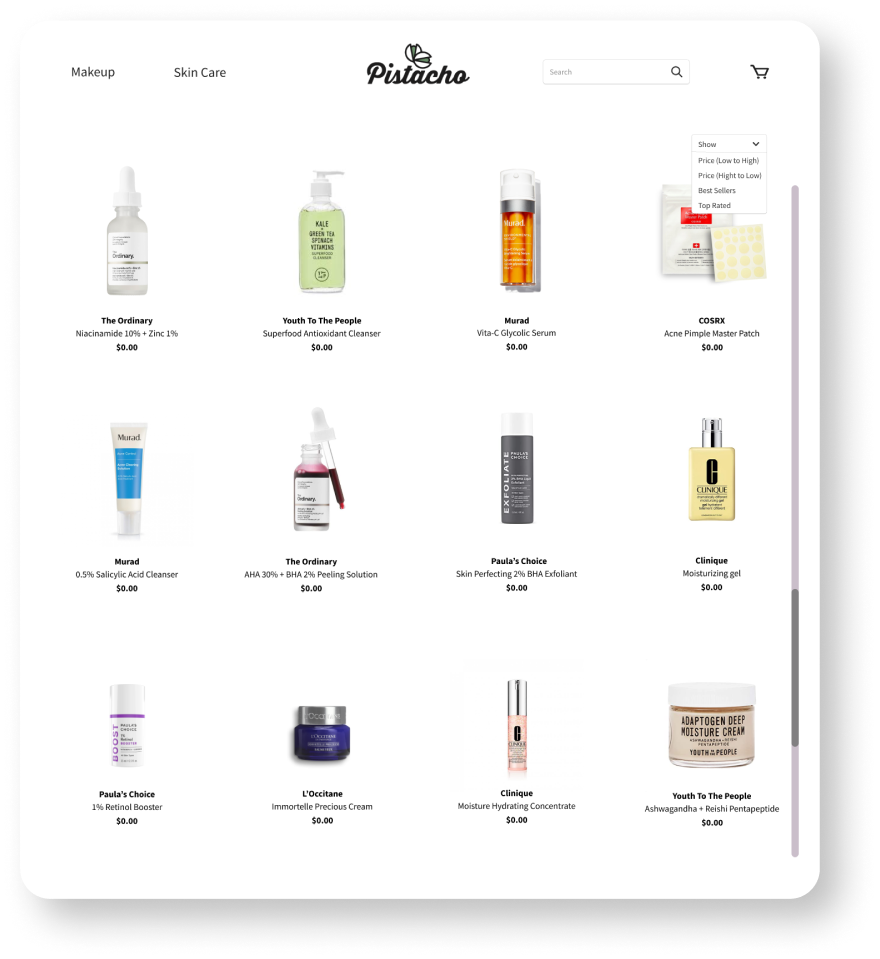
• Clean and clear displaying of items on the website
• Simple categorization of the products
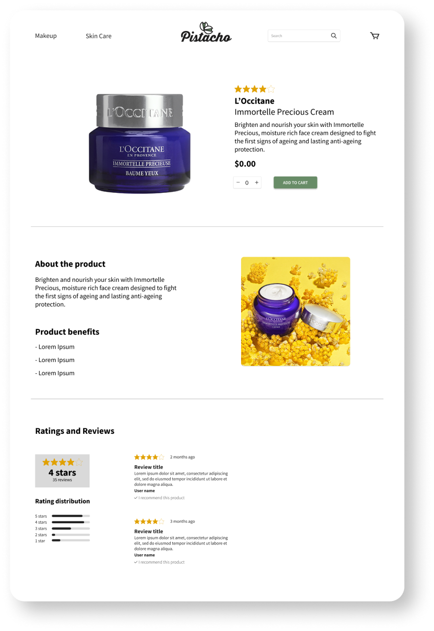
• User reviews to give the user confidence on the product they’re purchasing

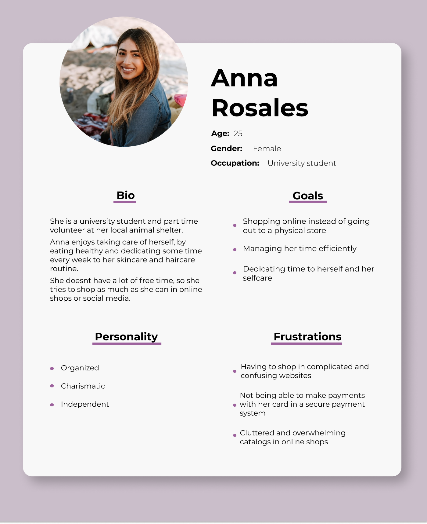
User personas:

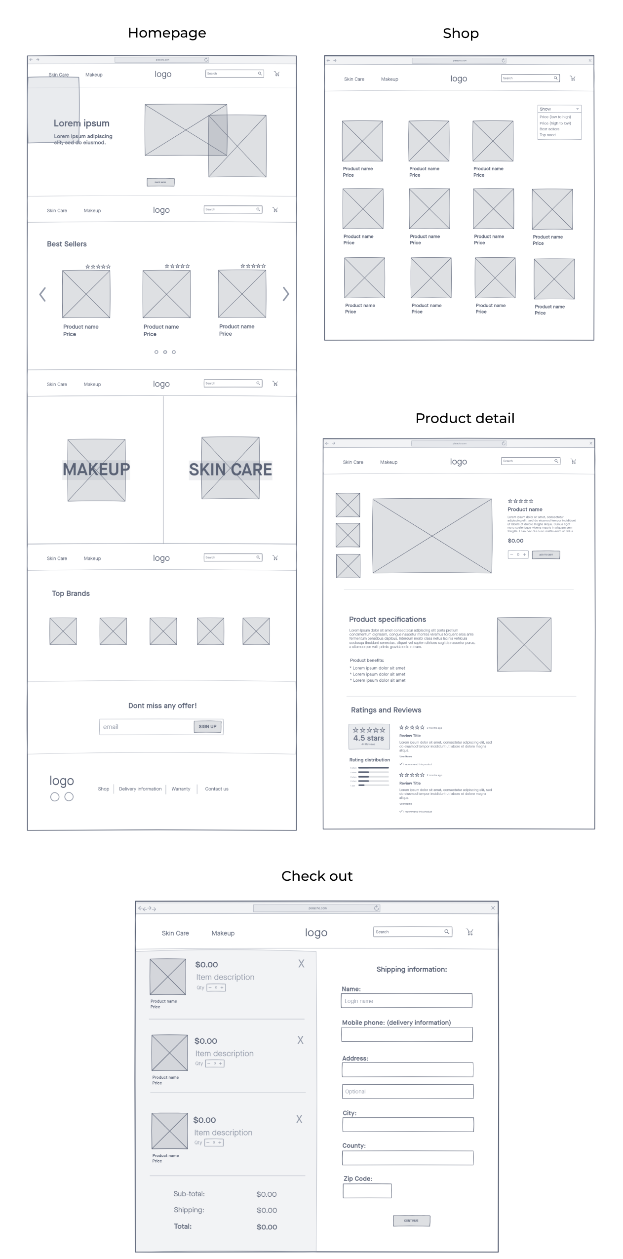
Wireframes

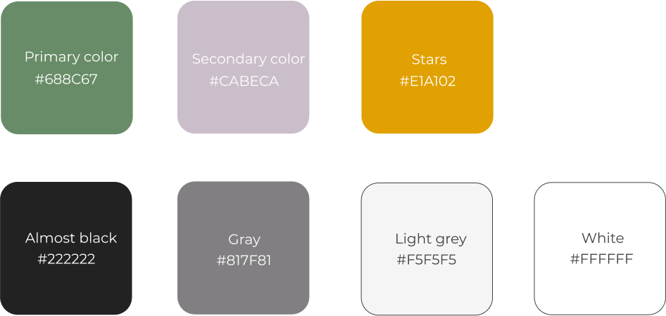
Color palette:

I selected the brand’s color as the primary one, and decided to contrast it with a complementary violet as the
secondary / accent color.

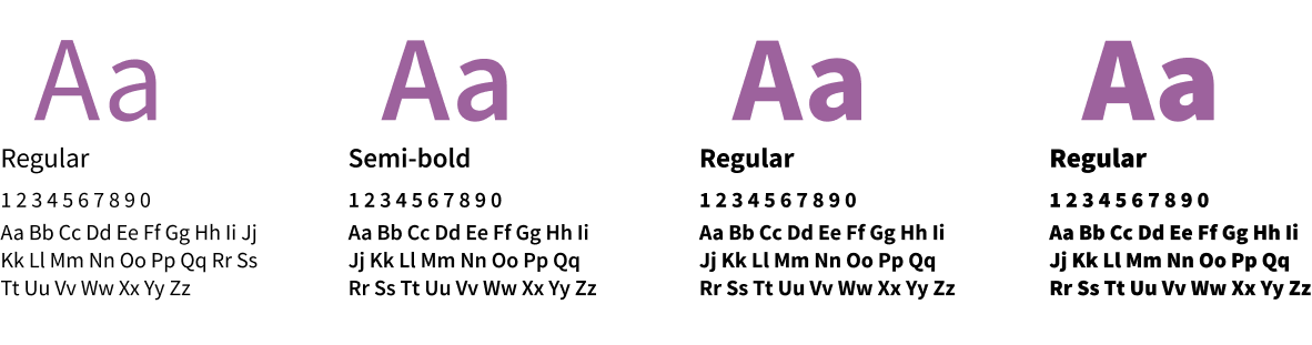
Typography:

I opted for Source Sans Pro as the main font in the website, varying between regular, semi-bold, bold and black styles for readability and text hiercharchy.

Final product:

Shop

Product detail

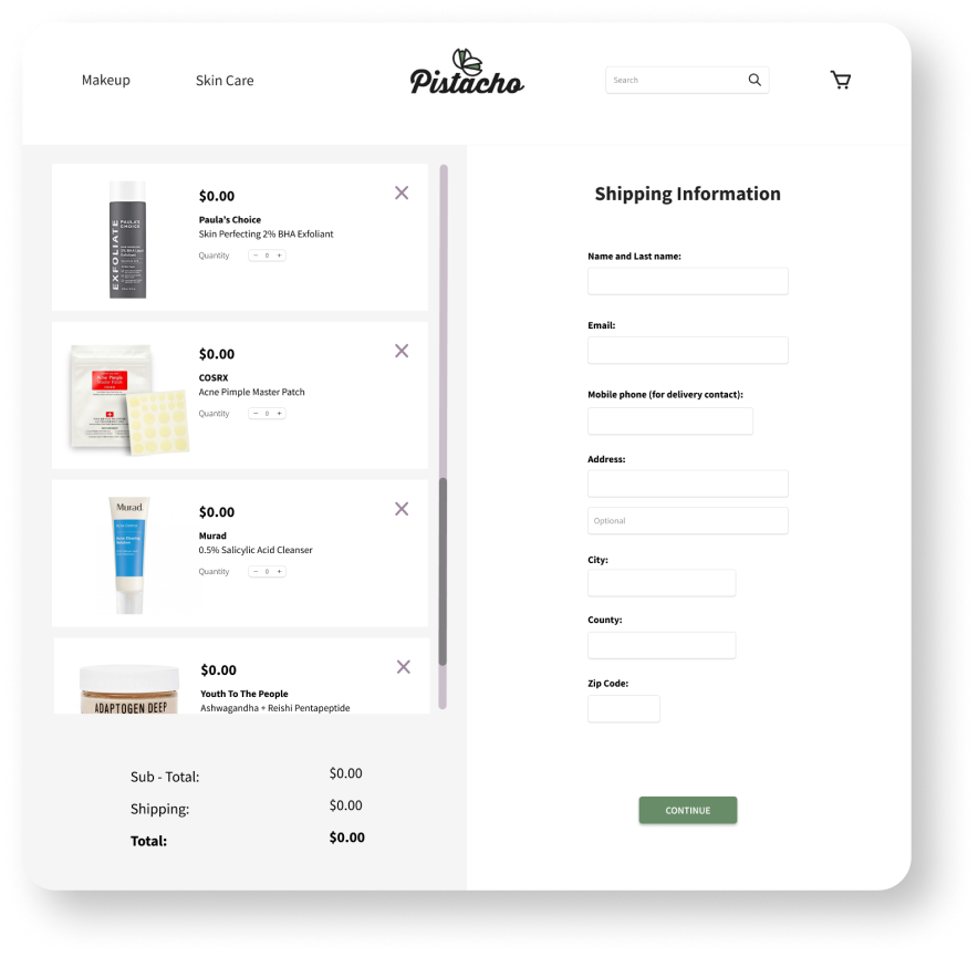
Cart

Final thoughts:

In this experience, I learned many things, not only in the design process but also during the investigation, as it helped me realize that different users have different needs that I have to take into consideration if I want my design to resolve (or avoid) their frustrations.

One of the challenges I faced during the investigation process, was translating the user’s input into key actions that were logical and helped me design in an organized way.