Laranja
The initial idea:
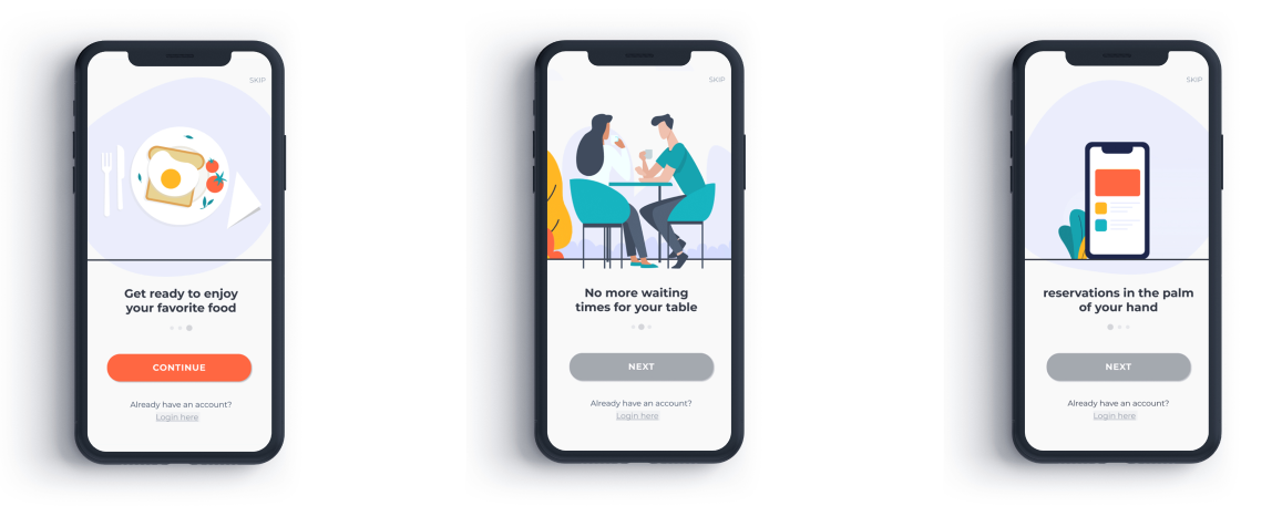
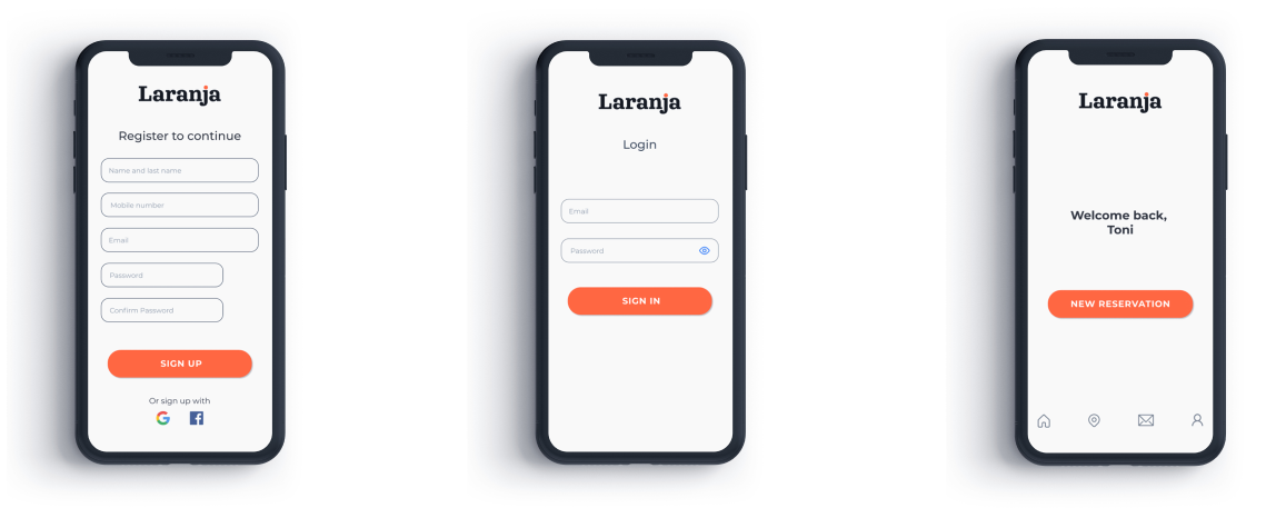
Laranja’s idea was to create a mobile app for an imaginary restaurant that wishes to provide other ways of booking for customers that don’t like calling or emailing.
Research:
Competitor Analysis
Upon researching other restaurant’s booking apps in the market, I discovered that they provide unnecessary information that overloads the screen, which can be overwhelming for the user, especially if they are in a hurry to book their table for the same day.
Interviews
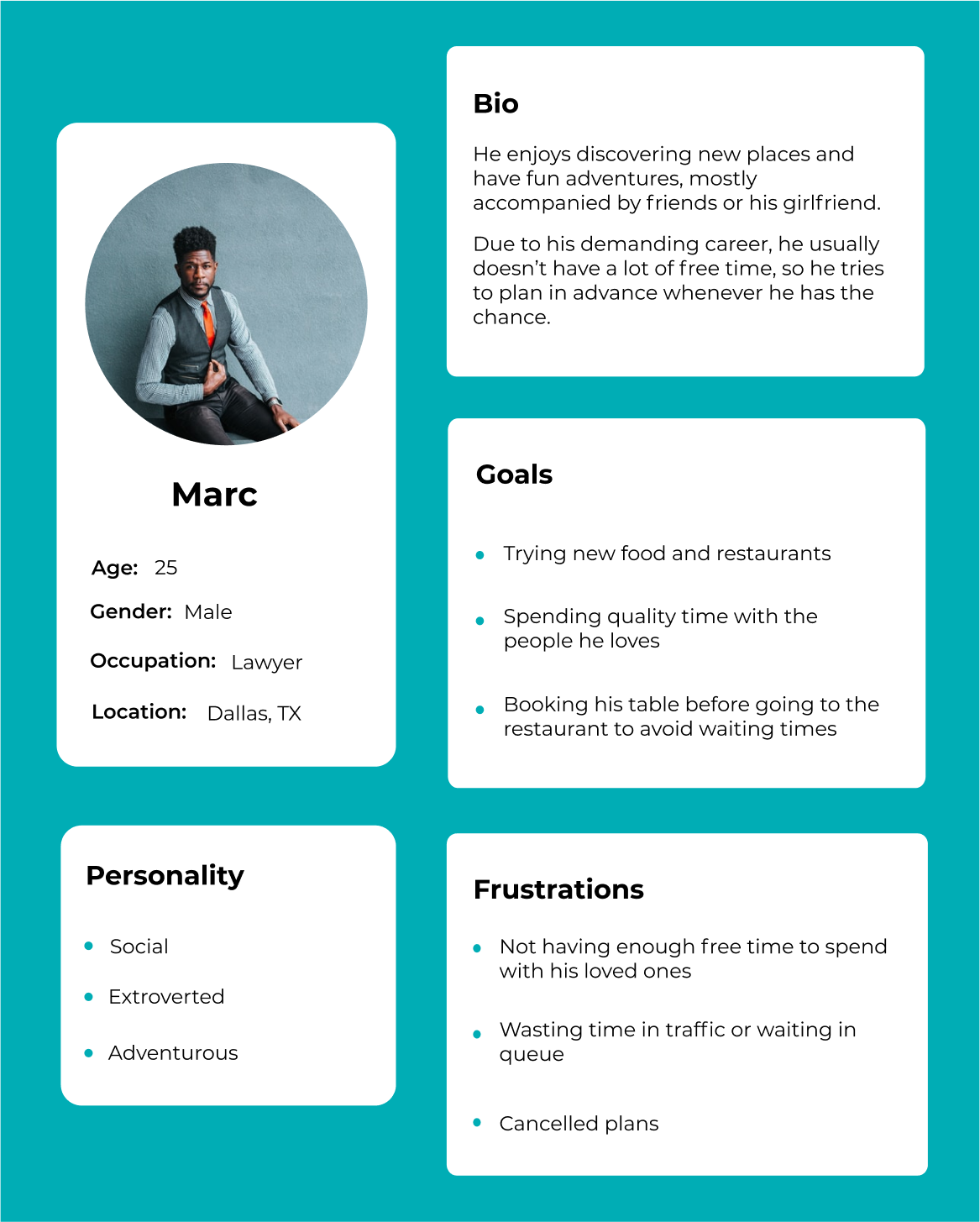
I interviewed 5 people who provided me with insights and frustrations with competitor’s apps and their own experiences booking with traditional ways.
Findings and results
I found the two following key points that guided my design choices:
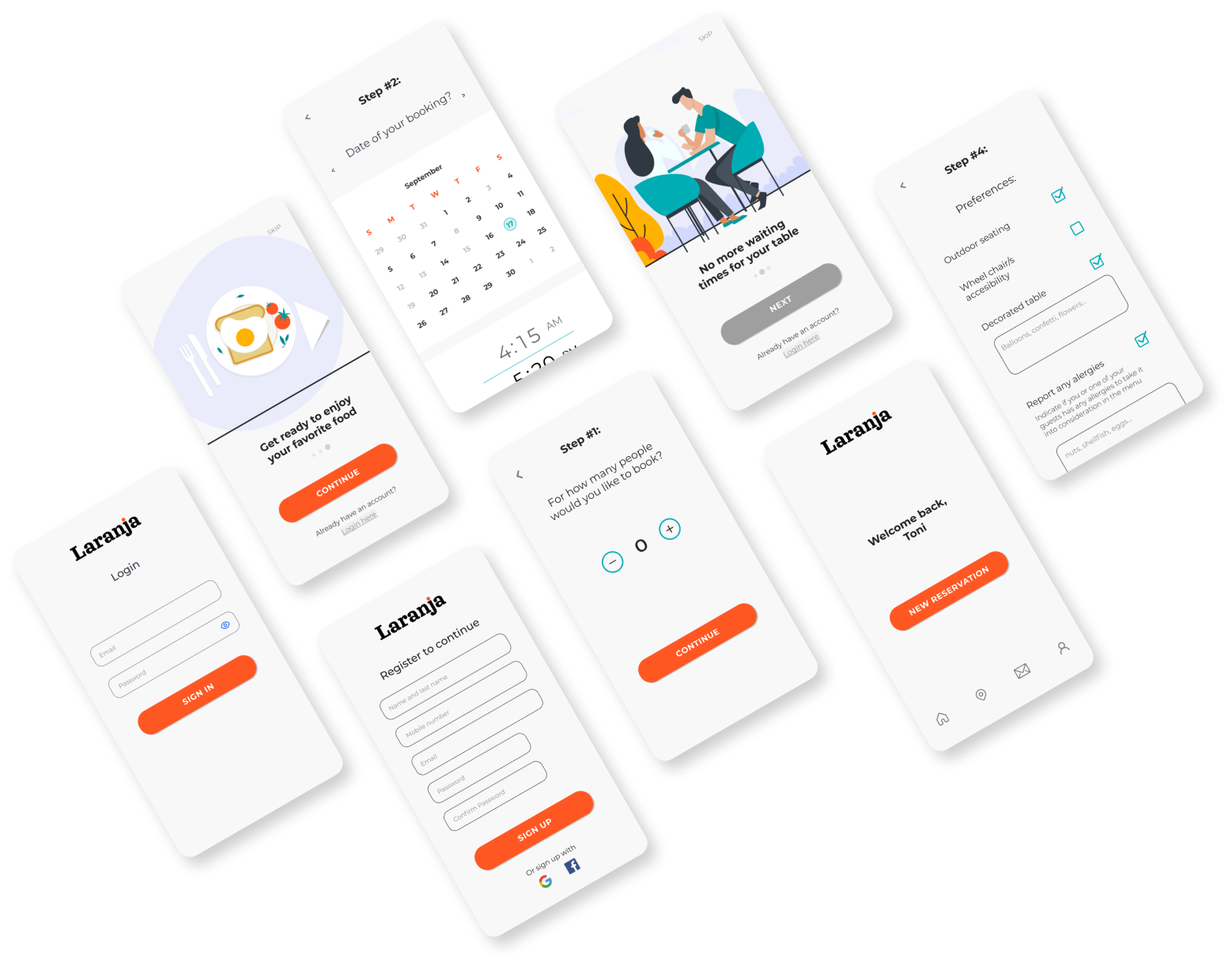
Users need a friendly, simple, and clear interface, that allows them to make their reservation fast and easy.
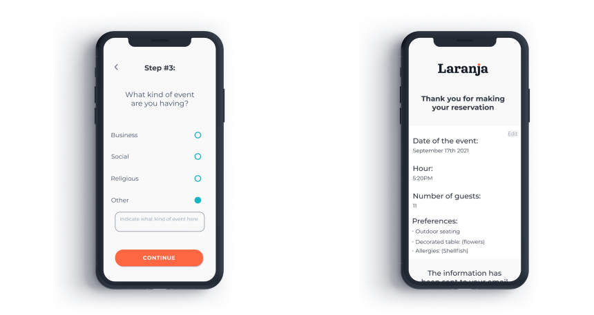
They also need immediate feedback and confirmation that their reservation has been successfully submitted, with all of the details they previously selected.
Color palette:
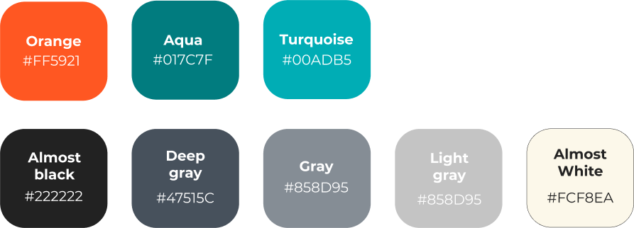
I decided to select the brand’s signature color as the primary one, to keep a congruent design.In addition, I selected a turquoise as the accent color to create a contrast with the primary color.
Typography:
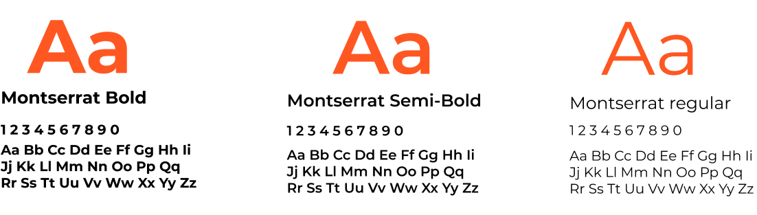
I opted for Montserrat as the main font in the app, varying between regular, semi-bold, and bold styles for readability and text hiercharchy.
Final product:
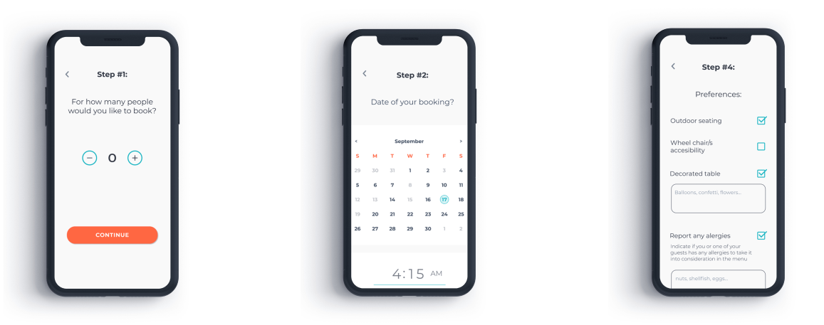
Steps to make a reservation
Final thoughts:
During the process of investigation and design, I faced many challenges.
The first one was deciding which strategies I could use to gather user data, my priority was to get the most real and accurate information as possible.
I also struggled to design the steps of the booking process, as I wanted to make sure it was a clear and simple path for the user.
Overall, I learned a lot from this experience, as I was able to simplify a process that often causes the user to feel overwhelmed with all the options and steps.